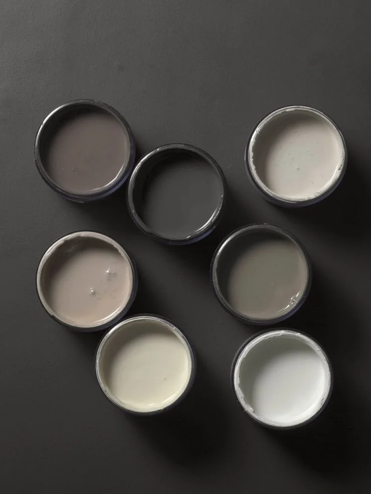
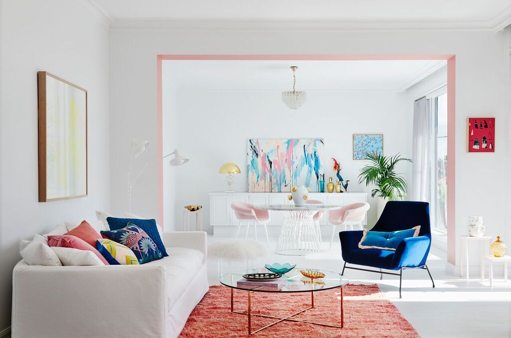
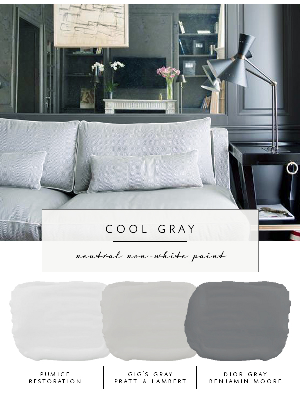
Whites and neutrals are by far the most popular colours we see in interiors, as they are unobtrusive, timeless and allow for additional features to be added with ease. With the endless collection of neutral colours available however, it can be overwhelming to choose which ONE to work with unless you have a trained expert eye. The culprit for this difficulty is the one thing that makes all of the whites and neutrals unique and that is its undertone!
We have previously reviewed some of the most popular whites and neutral paint colours and we looked at how the different undertones work better with certain styles, however we thought you may find it useful to better understand what the undertone actually means and how to identify it allowing you to make more efficient decisions when working on your own colour design problems.
Firstly, let's take a quick crash course in colour theory and clarify what undertone actually means. When whites and neutrals are mixed, the process involves mixing a few colours together to create that unique colour we reference on the wall of paint swatches available from your local hardware / paint specialist. Formulas are used to mix that exact colour and it will often be a certain percentage of red (R), green (G) and blue (B) with usually a true white base.
If we consider the technically 'white' white for a moment, when mixed with a drop of colours made from say 25% Red, 37.5% blue and 37.5% green, it is only to be expected that the outcome will be a cool version of white. This subtle inclusion of colours in the white base is how our white / neutral colours are made. Albeit it a slight show through, it is this colour underneath the white, which we know as the undertone.
The reason undertone is so important is it creates a harmonious environment. It is like being at a party where all friends have something in common. When a space references colours with similar undertones throughout, it creates a neutral scheme.
Alternatively, when unrelated colours are used as undertones in the same space such as red based walls and blue based floors, proportions and tone become super important to ensure the space stays balanced to the eye.
Some neutrals have an obvious amount of colour additives, making it really easy to categorise their undertones as warm or cool. In other cases though, the percentage of colours added can be so similar, it is can be trial and error to read the undertone especially when previewed in isolation. In order to solve this issue, placing your white / neutral colour on top of a primary colour will make things a lot clearer by either knocking back the undertone (meaning it's with its perfect pair) or bring the undertone to the forefront meaning it's with an opposing colour.
Let's work on an example together using one of Dulux's more popular whites, Lexicon. This colour has a very slight blue undertone, and when it appears with blue, the Lexicon will sit back appearing neutral. This is the effect we want to achieve. If we swap the blue item out for a red item however, all of a sudden the Lexicon transforms from it's neutral state and shows through the blue undertone.
To put this into a practice, you will find that beige neutrals (red / yellow / green undertones) work well with warmer accent colours like reds, yellows, oranges and warm greens like moss.
Likewise, grey based neutrals (blue / purple / green undertones) will sit more restfully with cooler accent colours like blues and cool based greens like teal.
In order to select the best white / neutral for your walls start with a warm or cool preference and run with that for every colour and material finish in your space. Things will sit naturally and the space feels considered and will be easily adapted overtime.
Be mindful that reading colour and undertones especially, come with practice. Designers have been professionally trained to see through colour and are in tune with variables that arise such as light, tone, contrast and texture. Should you have a colour problem to solve in your space and would benefit from our expert eye, please get in touch to arrange an Initial Design Consultation.
In the meantime, jump on over to our Facebook page to view our latest video on How to Compile a Colour Palette, which is loosely based on undertones. We have shared images of these completed palettes on our Instagram for your reference.
NEED MORE HELP?
OR
All images have been sourced from Google and we credit their owners via embedded hyperlinks directly back to them. Header image link is referenced in the source link below.


